In today’s competitive retail landscape, the physical store is more important than ever. It is a brand’s embassy, a place for customers to connect with products in a tangible way that e-commerce cannot replicate. To succeed, this physical space must do more than simply be an inventory and must create an experience.
Colour is one of the most powerful and subconscious tools in creating that experience. It is a silent salesperson, a psychological shortcut that influences customer emotions, guides their journey through your store, and can ultimately drive purchasing decisions. A deep understanding of the psychology of colour in retail is a fundamental component of strategic store design and one of the most impactful retail design trends today.
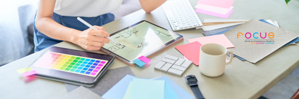
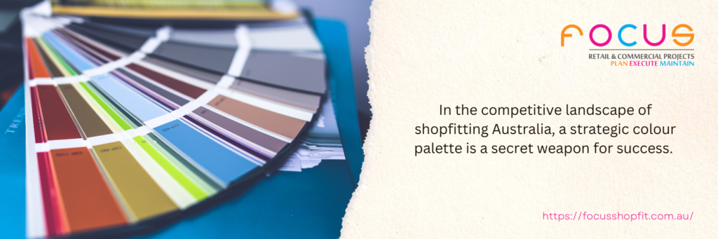
For any business undertaking a new fitout, harnessing the power of colour is essential. It can set your brand apart, create a memorable atmosphere, and contribute directly to your bottom line. In the highly competitive market of shopfitting in Australia, a strategic colour palette is a powerful tool for success, transforming your space from a simple shop into a destination. This guide delves deep into the principles of colour theory and psychology, providing actionable insights for your next commercial fitout project.
The foundational science behind colour and emotion
The connection between colour and emotion is not arbitrary. It is tied to a complex mix of biology, deep-seated cultural conditioning, and personal experience. Colours trigger specific physiological and emotional responses in our brains, often processed in the limbic system, the part of the brain responsible for emotion and memory. Warm colours, such as reds, oranges, and yellows, are physically stimulating. They possess longer wavelengths, which require more energy to process, and can actually increase a person’s heart rate, blood pressure, and create a sense of energy or urgency. In contrast, cool colours like blues, greens, and purples are soothing. Their shorter wavelengths are easier on the eye, fostering feelings of trust, security, and relaxation.
Leveraging these innate responses is the core of the psychology of colour in retail. By choosing a palette that aligns with your brand’s core message and the specific actions you want customers to take, you create a persuasive and highly effective retail environment. This strategic approach moves colour selection from a purely aesthetic choice to a data-informed business decision, a hallmark of modern retail design trends. It is also important to consider cultural nuances. For instance, while white symbolises purity in Western cultures, it is associated with mourning in many Eastern cultures.
A global brand must consider these differences, a topic often explored by international marketing resources like the World Advertising Research Center (WARC).
Decoding the colours: A detailed guide for your retail space
Each colour carries its own set of powerful connotations. Choosing the right primary and accent colours depends entirely on your brand identity, the products you sell, and the specific demographic you are targeting.
- Reds and oranges: The action drivers
Red is the colour of energy, passion, and excitement. It is one of the most visible colours to the human eye and is proven to stimulate appetite and create a sense of urgency. This is why it is used so frequently by fast-food chains and for clearance sale signage by retailers like JB Hi-Fi.Orange is its friendlier, more accessible counterpart. It still communicates energy but is tempered with a sense of fun, confidence, and warmth. Brands like Fanta and Amazon use orange to appear accessible and positive.
-
- Best for: Food courts, clearance sections, promotional displays, call-to-action buttons, and fitness centres.
-
- Use with caution: Overuse of red can create feelings of aggression or stress, so it is often best used as a strategic accent colour within a more balanced palette.
- Blues and greens: The trust builders
Blue is one of the most popular colours for brands worldwide because it evokes feelings of trust, security, and dependability. It has a calming effect on the mind, making it an ideal choice for businesses where customers may feel anxious or are making a significant purchase, such as banks (ANZ, Westpac), medical clinics, or high-value electronics retailers.Green is universally synonymous with nature, health, balance, and tranquility. It is the easiest colour for the eye to process, making it restful. This makes it a perfect choice for wellness brands, organic food stores like Whole Foods, and any business aiming to promote an eco-friendly message. The calming properties of green can make customers feel relaxed, encouraging them to spend more time browsing in your store, a key principle in effective retail fitouts.
- Purples and pinks: Royalty and demographics
Purple has long been associated with royalty, wisdom, and creativity. It can make a space feel luxurious and imaginative. Lighter shades like lavender are calming and are often used in beauty or wellness spaces. Deeper purples suggest sophistication and are popular with brands selling anti-ageing or premium products.Pink is strongly associated with youthfulness, fun, and romance. While traditionally feminine, its use is broadening. Bright pinks are energetic, while softer, dusky pinks are sophisticated and calming.
-
- Best for: Beauty salons, high-end confectionery, creative agencies (purple), and brands targeting a young or feminine demographic (pink).
- Black, white, and greys: The sophistication palette
A monochromatic palette communicates sophistication, elegance, and modernity. Black is the ultimate colour of luxury, power, and authority, used by high-end fashion labels like Chanel and premium technology brands to convey a sense of exclusivity and quality.White suggests minimalism, cleanliness, and simplicity, famously used by Apple to create a sense of space and focus on the product.Greys act as a perfect neutral, conveying balance, professionalism, and timeless style. When used thoughtfully by professional shopfitters in Australia
Applying colour psychology: The 60-30-10 rule in your fitout
Knowing what individual colours mean is only the first step. The application within your commercial space is where strategy truly comes into play. A proven method used in interior design is the “60-30-10 Rule.”
- 60% dominant colour: This is the main colour for your space, likely a neutral or a soft shade that covers about 60% of the area, including most of the walls. It sets the overall tone and acts as a backdrop for everything else.
- 30% secondary colour: This colour is used for about 30% of the space. It should be different enough to create contrast and interest. This might be used on a feature wall, for furniture, or in key display areas.
- 10% accent colour: This is the boldest colour, used for about 10% of the space. It is used to create visual focus and draw the eye to specific areas, like promotional signage, cushions, or key pieces of decor. This is where you would strategically use a colour like red for a call to action.
This rule provides a framework for creating a balanced, professional, and visually appealing space that effectively uses the power of the psychology of colour in retail. A well-planned colour scheme is a foundational element of your store’s design.
When approached with a clear understanding of its psychological impact, it can transform a simple retail space into a powerful sales environment. The team at Focus Shopfit has extensive experience in creating colour strategies that align with our clients’ brands and business goals.
Inspired to create something amazing? Seeing what’s possible is the first step. At Focus Shopfit, we’ve helped businesses across Australia create stunning environments that drive sales and enhance customer experience. To discuss how we can bring your vision to life, contact us today.